Color Palette Generator
Generate coordinated color schemes from a base color, then copy the palette into design systems, mockups, landing pages, or component libraries. Useful for finding combinations that feel intentional instead of random.
Find this tool useful? Support the project to keep it free!
Buy me a coffeeWhat is Color Palette Generator?
Color Palette Generator builds coordinated color schemes from a starting color so you can move from a single swatch to a usable UI or brand palette quickly. Instead of guessing several related colors by eye, you can explore common harmony models like complementary, analogous, and triadic.
It is useful when a design needs cohesion across backgrounds, accents, buttons, illustrations, or charts. A strong palette gives structure to the rest of the interface, but it still needs practical checks for contrast and hierarchy before shipping.
How to Use Color Palette Generator
Pick a base color using the color picker
Select a color harmony type
View the generated palette
Copy individual colors or the entire palette
Common Use Cases
- Product designers building a starting palette for a dashboard, landing page, or design system.
- Brand teams exploring supporting colors around a primary logo or campaign color.
- Frontend developers finding coordinated accent colors before implementing themes or component states.
- Creators building a more intentional color set for slides, social graphics, or lightweight brand kits.
Example Input and Output
Starting from one anchor color can quickly produce a more consistent UI palette than picking isolated swatches by eye.
Base color: #2563eb
Harmony: analogous#1d4ed8
#2563eb
#3b82f6
#60a5fa
#93c5fdAccessibility
A beautiful palette is not automatically readable. Test candidate foreground/background pairs in the Color Contrast Checker before using them for body text or small labels.
Workflow tip
Use one or two colors from the generated palette as accents, not every swatch everywhere. Palettes work best when there is still a clear hierarchy in the UI.
Frequently Asked Questions
What are color harmonies?
Can I start from an existing brand color?
Does a nice-looking palette automatically pass accessibility checks?
Which harmony type is best for UI work?
Can I copy the generated colors as hex values?
Why do some generated palettes feel too saturated?
Related Tools
Posts for This Tool
Broader workflow content that links this tool back into the wider cluster.

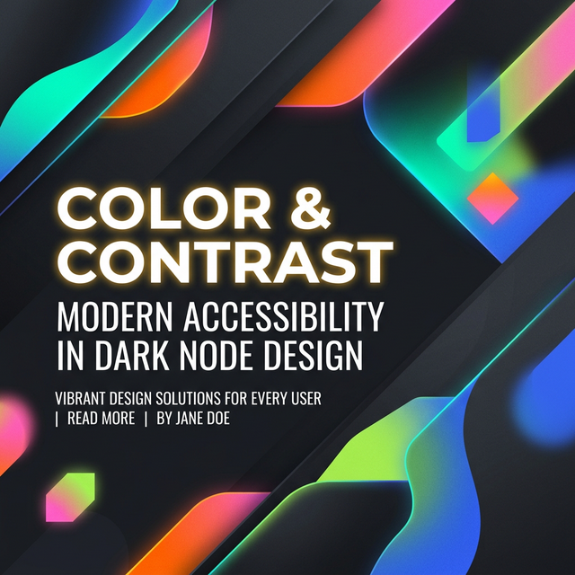
CSS Gradient Tips for Better UI
Learn how to make gradients look intentional, keep text readable, and use gradients as supporting UI structure rather than visual noise.
How to Check Color Contrast for Accessibility
A practical guide to checking contrast for text, buttons, and UI states without confusing AA, AAA, gradients, or large-text exceptions.